Wednesday, April 6, 2016

WEEK 12: BATA

Week 12: Bata

Advertising: Project 4 (40%) Bata (Power: men's and women's shoes)

With the completion of Project 1, 2 & 3 you have gained empirical knowledge of Bernbach’s principles in advertising and the role and functions of an advertising art director. In the process, you have developed a basic understanding of advertising strategy, which you will further develop as you embark on Project 4.

Bata shoes first store opened in the Capitol Building, Singapore in 1930. In July the same year, Tomas Bata had established Bata Shoe Company Limited to carry on the business as manufacturers, distributors and marketers of footwear, as well as dealers in leather and rubber goods. Five years later, a factory was built in Klang, Selangor to produce PVC injected footwear for both domestic and overseas markets.

Bata is synonymous with affordable shoes of good quality, and seems to be a popular choice amongst the working class Malaysians. In order to cater to a wider market segment Bata has created different branded products e.g.: Marie Claire, North Star, Weinbrenner, Power, school shoes and others.

For the purpose of this project, your focus will be limited to Bata's Power brand of shoes (sports sneakers) for women and men. Your task is to identify the market segment, research competitor strategies, develop a distinct strategy upon which the visual and copy direction will be based on. As part of Project 4's requirement, the advertisement created must be copy heavy and typographically intensive. Visuals can be used to enhance and support the copy. (Examples have been furnished in the Facebook Group). 

The type of print media used must be determined based on sound reasoning; research, strategy and target segment. Upon completion of the print media, the ad needs to be translated into a TVC (Television or Online Commercial). The TVC ad must be based on the same strategy and consist of the same Ad/Campaign message. 

.

Resource in Bata:


Deadline: Week 15 (28th April 2016)


Assessment Plan

Project 04 (40% Summative)

20% STRATEGY
10% Strategy: Research Strategy (Client strategy, Market Segment Study/Identification, Competitor Strategies)
10% Strategy: Direction & Communication Strategy (Copy/Visual Message & Media)

20% CAMPAIGN
10% Communication
10% Art Direction

Marking Criteria 

STRATEGY 20% 

Research strategy (10%)
There must be evidence of research on the client and competitors current marketing and advertising strategies. The targeted consumer must be clearly identified and described (using behavioral, demographic, psychographic and geographic segmentation would be an advantage). The journey from start to finish must be methodically documented and dated. Oral or written Feedback must be documented on a week by week basis. The written reflections must be clear, concise, revealing and insightful.

Direction & Communication Strategy (10%)
There must be visible evidence of exploration of a number of different strategies using mind maps, sketches, thoughts and epiphanies on the basis of the outcome of the research strategy. The exploration should result in a distinctive strategy that relates to the targeted consumer segment. The developed strategy needs to set the brand apart from its competitors within that market segment.

CAMPAIGN 20%

Communication (10%)
The message needs to be creative, clear and concise. The message has to be truthful and not gimmicky. The message must be unique in order to stand out from the rest of the competitors. The message must have a sense of personality that relates to, or reflects the target audience.

Art Direction (10%)
Art direction here refers to the visual and copy "style" for the overall design. The crafting of the visual and copy must reflect good composition, appropriate choice of typeface & visual, hierarchy in communication, appropriate choice of colour and a synergy of style between visual and copy. Good art direction (visual & copy style) will reflect strong proficiency in the use of relevant software to realize the style sought after. Good art direction (layout, visual & copy style) must consist of the detailing that is involved in the creation of the advertisement.

Research

Examples of copy heavy advertisements:


Research on Bata and its market:

9           employee incentives & rewards, business gifting and customer promotions. They are also very ideal for         ...
10PSCHYCOGRAPHIC SEGMENTATION:        1. Bata’s target group includes all the three sections of the society .They like the...

73. Advertising, Sales Promotion and Segmentation Strategy Followed By Bata above the   Line Sales Promotion-     TAG-LINE...
8     automobiles, metals, petroleum, construction and agriculture. “Bata Industrials is the world leader in high     perf...

Example of Bata advertisements:


Bata stores:


Strategies & Ideas

I am yet to have any ideas on how I will go through with this project this far.
Image:


Copy:


Feedback

Mr. Vinod:
I viewed your post for week 12 and your secondary research is good, you have done your research on copy heavy ads, which now give you a rough idea as to what they entail, you have done your research on Bata, the company, and it's advertising. All in all, it is a goo start. 

You have left out your reflection writing and your attempt at formulating a strategy and an idea. I hope you complete that before the weekend. 

My suggestion when attempting this kind of ad is to immerse yourself in the values of the company, it's current marketing strategy and an understanding of its consumers. One thing is clear about the consumer (target audience) they are your average individual, most likely middle/lower middle-class. This is not a brand that seeks to be NIKE. It is a brand for the average joe. But yet it provides a vital option for the average joe who isn't able to afford a NIKE/Adidas or any of the other premium brands. As, such in your strategy do not attempt to make it a premium brand in the tone/approach of your copy when you do attempt to write one. 

You can write a headline and then build a copy around it. Or you can write the copy and extract a headline from it (the latter is what I usually do).

This ad will need you to communicate (value) persuade (to buy) and inspire (that they are part of something? What that is, is up to you).

Use the above as a guide, but feel free to chart your own course if your research and thinking suggest something different. 


Remember the ad is a copy heavy ad, and the image plays a secondary role (if at all).

Reflection:

Experience

With there being a Bata in Zimbabwe, I was actually able to  visit the store and get a better feel of its 'personality'. I found this to aid in getting an idea of the client and it's image. Looking at the products and the store outlook was illuminating as well. 


Observation

This was actually my first time experiencing Bata in this way. Previously, in Malaysia, I was of the perception that Bata was expensive. I will try look into why I was of this impression and if I wasn't the only one who thought so. 

Findings

In fully experiencing Bata, I purchased two pairs of canvas shoes. I liked how down-to-earth they were, and they only cost $7.90 a pair. Looking forward to engaging conversations with others regarding them while wearing it. 

Thursday, March 24, 2016

WEEK 10: QUIZ

Week 10: Quiz

Advertising: Project 3 (15%)

We have learned about marketing being the action or business of promoting and selling, while advertising is the art of communication and persuasion. 

This video clip went viral recently: http://youtu.be/iPQJe7yeVAE it shows a Volkwagen Polo ramming a Malaysian Police car from the back and then speeding off. 

The incident was recorded by a dashboard camera and was uploaded onto YouTube which then went viral on social media.

Viral marketing/advertising (sometimes) uses a pre-existing social phenomenon (like this incident) to advance a service or a product by leveraging on its popularity.

Task

Your task is to leverage on this incident that has gone viral on behalf of Volkswagen's Polo brand of cars, and increase the brand awareness of the car. You can approach this by using humor, wit, or any other means necessary and make play of the incident to ride on its popularity. 

Client: Volkswagen

Medium: Online Web banner
336 x 280 pixels
(Use makeagif.com to animate your banner. Use Adobe Illustrator to create your Ad.)

Your submission will consists of:
1) Flat Ad design measuring 336 x 280 pixels (not animated)
2) Animated flat design 336 x 280 pixels

News Portals: The Malaysian Insider, The Star, The Malay Mail Online, etc.
The ad will feature on the home page of the news sites and on the side of the online article featuring the incident. 

Deadline: Thursday 10pm, 5/11/15.

Marking Criteria

Communication (5%)

The message needs to be creative, clear and concise. The message has to be honest and not gimmicky. The message must be unique in order to stand out from the rest of the competitors. The message must have a sense of personality that relates to, or reflects the target audience.

Art Direction (5%)

Art direction here refers to the visual and copy "style" for the overall design. The crafting of the visual and copy must reflect good composition, appropriate choice of typeface & visual, hierarchy in communication, appropriate choice of colour and a synergy of style between visual and copy. Good art direction (visual & copy style) will reflect strong proficiency in the use of relevant software to realize the style sought after. Good art direction (layout, visual & copy style) must consist of the detailing that is involved in the creation of the advertisement.

Process (5%)

There must be exploration in the form of sketches, mind maps, thoughts and epiphanies. The journey from start to finish must be methodically documented and dated. oral or written Feedback must be documented. The written reflections must be clear, concise, revealing and insightful.

Articles:


Research

So basically I researched some of the Volkswagen ads online to get a clearer understanding about the methods that they use to convey a message that increases the brand awareness of the car and how their ads were designed. Below are few of the examples that I found. I also researched the best car advertisements, immaterial to brand to prompt ideas as well.


Strategies & Ideas

Image:
  • a regular image of a VW Polo with a caption
  • a damaged Polo with the caption "You should see the other guy"
  • the view from the drivers side, with a Polo in the rear view mirror
  • just a picture of the Polo in the rear view mirror

Copy:
  • Street credit upgraded
  • Gangstas don't discriminate
  • You don't want to be in front of me
  • You've seen what happens to slow drivers in front of me
  • Too fast for my/your own good
  • Legit celebrities all have viral videos
  • Reckless or not, you that video makes us look good
  • We're German. So's the Rottweiler.
  • With great power comes great responsibility. Responsibility to use that power.
  • Did you see the crash test? 
  • Proven: Impact Protection
  • You should see the other guy
I liked the idea of using the rear view mirror most of all, but when I began creating the advert, I found that I didnt quite like how it looked.

I then moved to using a side mirror and I was much happier with the results. While creating that image, it hit me that I should use a version of the line 'objects in the mirror are closer than they appear' to aid its relation.

Submission


GIF: http://makeagif.com/zxhje2

Feedback

I have viewed your attempt for the Practical Quiz (Project 3), and I must say, I am very pleased. It is a marked improvement from Project 2. It was witty and relevant to the incident that your Ad seeks to ride on. 

The art direction was good, however your choice of font wasn't same as what is usually used by VW in their ads. A little research on that would have give you the answer. The static ad and the gif animation was good. You managed to communicate effectively and memorably. You were able to illicit an emotional reaction — a smile in the mind. 

All in all, good work.


Thursday, March 17, 2016

H&M FEMALE AD: FINAL

H&M Female Ad: Final

Instructions


Project 02 - Advertising Art Direction (20%)

Using what you have gained from understanding and applying the Bernbach’s principles in advertising, and the knowledge gained in understanding the role and functions of an advertising art director, execute a well crafted magazine advertisement.
Your client is H&M Fashion and it intends to wish its young female clients a Happy Merdeka via Female Magazine. Your job is to ensure, that the personality and style (voice and tone) of H&M’s brand and identity is retained in the creation of this ad whilst wishing female Malaysians a Happy Merdeka. Be careful not to use the usual Merdeka gimmicks. What ever you do, you must retain H&M’s young, hip, modern, fashionable, cool and exuberant disposition in your art direction when conveying the message.

Magazine: femaleSize: 210 (w) x 275 (h), Bleed: 216 (w) x 281 (h), text are: 185 (w) x 255 (h).


Marking Criteria

Communication (5%)
The message needs to be creative, clear and concise. The message has to be truthful and not gimmicky. The message must be unique in order to stand out from the rest of the competitors. The message must have a sense of personality that relates to, or reflects the target audience.

Visual Impact (5%)

Visual impact here refers to the overall effect of the layout and or the artwork (visual or copy) in the layout. The visual/copy must integrate well with the message for there to be impact. The visual/copy must enhance the message to create a smile in the mind. The visual/copy must relate or connect with the reader and should illicit an emotional reaction. The visual/copy must be memorable. The visual/copy must have a sense of personality that relates to, or reflects the target audience.

Art Direction (5%)

Art direction here refers to the visual and copy “style” for the overall design. The crafting of the visual and copy must reflect good composition, appropriate choice of typeface & visual, hierarchy in communication, appropriate choice of colour and a synergy of style between visual and copy. Good art direction (visual & copy style) will reflect strong proficiency in the use of relevant software to realize the style sought after. Good art direction (layout, visual & copy style) must consist of the detailing that is involved in the creation of the advertisement.

Process (5%)

There must be exploration in the form of sketches, mind maps, thoughts and epiphanies. The journey from start to finish must be methodically documented and dated. oral or written Feedback must be documented. The written reflections must be clear, concise, revealing and insightful.


Learning goal:

1. The student will understand the role of the advertising art director and apply that understanding.


Learning Outcome:

1)Writing & presenting Competencies – Demonstrate knowledge and understanding of design principles, technical processes, tools and software.
2)Critical Thinking Competencies – Use critical thinking to explore, analyze and test a diversity of conceptual ideas.
3)Creating & Documenting Competencies - Plan and execute unique creative works.
4)Appraising & Valuing Competencies – Constructively assess work by yourself and others.


Deadline:

Week 10


Ideas & Strategies:

Although I could take a picture of one of my African or Caucasian friends here in Zimbabwe, I felt that it would not resonate well in regards to an Malaysian Independence advertisement.
However, I finally managed to obtain a picture that I really liked. Another friend of mine from Sarawak who has been in contact with me this whole time assisted through Skype in inquiring on what I'm visualizing and then we worked remotely on getting the right picture. What I completely love was the colors in the shot and her attempt to dress as per H&M's style.

The price caption on the bottom was a final thought that I felt added some uniqueness.


Final:


Feedback

Mr. Vinod:
I've viewed you final work for Project 2: Art Direction (week 9). While there was effort in sourcing the image for the Ad, the benefit would have been far more substantial were you to have photographed the image yourself. Putting that aside, the image did give a sense of freedom, so visually you were on message. That message however gets watered down and less memorable when the headline “H&M wishes you a Selamat Hari Merdeka” is read. Where is the twist? You needed a twisted headline to enhance the message of freedom & merdeka. 

I have given you many-many examples from in week 6-7-8, but it appears you have not managed to crack this puzzle. 

From a design standpoint the H&M logo is disproportionally big, especially when compared to the “wishes you a... ”. The choice of font for the “wishes you a... ” could have been better. The font chosen is to ubiquitous and doesn't sit well with the H&M brand image. 

What would have made a slightly more interesting headline would have been the details of cost leading to Freedom: Priceless. Following this in small text could have been “wishes you a... ”. While this would have made the Ad slightly more memorable, it still would have lacked a bounce.

Reflection:

Experience

It's very challenging having every week's progress turned down, but I'm relieved that I've got this far and with an end product that I am happy with.

Observation

Although I'm happy with the resulting advert, I'm apprehensive as to how it will be graded.

Findings

It was interesting working with CorelDraw as it's different from Illustrator. However, I'm starting to think that I prefer it.

Wednesday, March 9, 2016

WEEK 8: H&M FEMALE AD

Week 8: H&M Female Ad

Instructions


Project 02 - Advertising Art Direction (20%)

Using what you have gained from understanding and applying the Bernbach’s principles in advertising, and the knowledge gained in understanding the role and functions of an advertising art director, execute a well crafted magazine advertisement.
Your client is H&M Fashion and it intends to wish its young female clients a Happy Merdeka via Female Magazine. Your job is to ensure, that the personality and style (voice and tone) of H&M’s brand and identity is retained in the creation of this ad whilst wishing female Malaysians a Happy Merdeka. Be careful not to use the usual Merdeka gimmicks. What ever you do, you must retain H&M’s young, hip, modern, fashionable, cool and exuberant disposition in your art direction when conveying the message.

Magazine: femaleSize: 210 (w) x 275 (h), Bleed: 216 (w) x 281 (h), text are: 185 (w) x 255 (h).


Marking Criteria

Communication (5%)
The message needs to be creative, clear and concise. The message has to be truthful and not gimmicky. The message must be unique in order to stand out from the rest of the competitors. The message must have a sense of personality that relates to, or reflects the target audience.

Visual Impact (5%)

Visual impact here refers to the overall effect of the layout and or the artwork (visual or copy) in the layout. The visual/copy must integrate well with the message for there to be impact. The visual/copy must enhance the message to create a smile in the mind. The visual/copy must relate or connect with the reader and should illicit an emotional reaction. The visual/copy must be memorable. The visual/copy must have a sense of personality that relates to, or reflects the target audience.

Art Direction (5%)

Art direction here refers to the visual and copy “style” for the overall design. The crafting of the visual and copy must reflect good composition, appropriate choice of typeface & visual, hierarchy in communication, appropriate choice of colour and a synergy of style between visual and copy. Good art direction (visual & copy style) will reflect strong proficiency in the use of relevant software to realize the style sought after. Good art direction (layout, visual & copy style) must consist of the detailing that is involved in the creation of the advertisement.

Process (5%)

There must be exploration in the form of sketches, mind maps, thoughts and epiphanies. The journey from start to finish must be methodically documented and dated. oral or written Feedback must be documented. The written reflections must be clear, concise, revealing and insightful.


Learning goal:

1. The student will understand the role of the advertising art director and apply that understanding.


Learning Outcome:

1)Writing & presenting Competencies – Demonstrate knowledge and understanding of design principles, technical processes, tools and software.
2)Critical Thinking Competencies – Use critical thinking to explore, analyze and test a diversity of conceptual ideas.
3)Creating & Documenting Competencies - Plan and execute unique creative works.
4)Appraising & Valuing Competencies – Constructively assess work by yourself and others.


Deadline:

Week 10


Ideas & Strategies:

I remembered a friend of mine in the UK who did some modelling and I went through some of her pictures. Luckily, there were some pictures that I was interested in and after speaking to her and explaining the need to use her pictures, she consented. Below are the pictures as well as ideas I have for the copy.


Copy: Which side of the fence are you on? 


Copy: Enough #merdeka to be yourself?


Feedback:

Mr. Vinod:

I viewed you progression for week 8, I'm afraid you have not made progress by way of visual and line interplay.

Reflection:

Experience

Once I found the find of pictures I wanted, things got a little easier and I felt better as well. The true challenge that I'm facing is being overseas without my friends who I could use as models.

Observation

I now need to gel my pictures with a suitable copy as well as overall layout. I'm heavily partial to the picture with the fence, although it doesn't quite portray H&M usual colors.

Findings

I learned that sometimes things don't actually turn out like how you want it to be. It is probably because when you tel something to people they may have a different perception on the same idea resulting in a diflferent outcome rather than what is expected. Based on this weeks feedback, I will try to improve my images and copy of my advertisement.

Wednesday, March 2, 2016

WEEK 7: H&M FEMALE AD

Week 7: H&M Female Ad

Instructions


Project 02 - Advertising Art Direction (20%)

Using what you have gained from understanding and applying the Bernbach’s principles in advertising, and the knowledge gained in understanding the role and functions of an advertising art director, execute a well crafted magazine advertisement.
Your client is H&M Fashion and it intends to wish its young female clients a Happy Merdeka via Female Magazine. Your job is to ensure, that the personality and style (voice and tone) of H&M’s brand and identity is retained in the creation of this ad whilst wishing female Malaysians a Happy Merdeka. Be careful not to use the usual Merdeka gimmicks. What ever you do, you must retain H&M’s young, hip, modern, fashionable, cool and exuberant disposition in your art direction when conveying the message.

Magazine: femaleSize: 210 (w) x 275 (h), Bleed: 216 (w) x 281 (h), text are: 185 (w) x 255 (h).


Marking Criteria

Communication (5%)
The message needs to be creative, clear and concise. The message has to be truthful and not gimmicky. The message must be unique in order to stand out from the rest of the competitors. The message must have a sense of personality that relates to, or reflects the target audience.

Visual Impact (5%)

Visual impact here refers to the overall effect of the layout and or the artwork (visual or copy) in the layout. The visual/copy must integrate well with the message for there to be impact. The visual/copy must enhance the message to create a smile in the mind. The visual/copy must relate or connect with the reader and should illicit an emotional reaction. The visual/copy must be memorable. The visual/copy must have a sense of personality that relates to, or reflects the target audience.

Art Direction (5%)

Art direction here refers to the visual and copy “style” for the overall design. The crafting of the visual and copy must reflect good composition, appropriate choice of typeface & visual, hierarchy in communication, appropriate choice of colour and a synergy of style between visual and copy. Good art direction (visual & copy style) will reflect strong proficiency in the use of relevant software to realize the style sought after. Good art direction (layout, visual & copy style) must consist of the detailing that is involved in the creation of the advertisement.

Process (5%)

There must be exploration in the form of sketches, mind maps, thoughts and epiphanies. The journey from start to finish must be methodically documented and dated. oral or written Feedback must be documented. The written reflections must be clear, concise, revealing and insightful.


Learning goal:

1. The student will understand the role of the advertising art director and apply that understanding.


Learning Outcome:

1)Writing & presenting Competencies – Demonstrate knowledge and understanding of design principles, technical processes, tools and software.
2)Critical Thinking Competencies – Use critical thinking to explore, analyze and test a diversity of conceptual ideas.
3)Creating & Documenting Competencies - Plan and execute unique creative works.
4)Appraising & Valuing Competencies – Constructively assess work by yourself and others.


Deadline:

Week 10


Research

Secondary: 
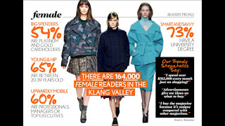
I looked at some of the details on the H&M fashion magazine's readers here. What I found was that:


  • 54% have platinum and gold cardholders
  • 65% are between 20-39 years old
  • 60% are professionals, managers or top executives
  • 73% have a university degree

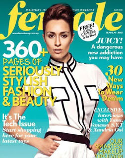
I then researched Female magazine in order to get an idea of their style and their target audience.


With that, I created a mind-map to draw together what I learnt about Female magazine and it's readers.


Ideas & Strategies:

As mentioned before, I'm still partially inclined to using a single solitary model in a freedom-like pose or stance, despite its boringness. 


Here are some test shots that I did the week before with a friend.


I think I really need to look outside the box of using such a cliched depiction of freedom.


Feedback:

Mr. Vinod:
I just viewed you week 7 progression for your project 2. There seems to be more depth in this week's research. There was also indication of analysis by way of the mind-map. This was needed in the second week so that you could have used the week that passed to concentrate solely on strategy and ideation. I see you have finally looked into the readership and documented your findings, good. Again it would have been better if you could have done this in the second week because it would have informed you in your mind-mapping and development of the strategy and ideas.

There are two major tasks that lie ahead, the function of this ad is to 1) showcase your ability to develop a strategy and an Ad message for H&M that creatively wishes a Happy Merdeka to Female Magazine readers, and 2) to showcase your understanding of the role of an Art Director in the visualisation and crafting of the well designed ad., and your ability to create a visual that enhances the Ad message (headline).

Your deadline for Project 2 as stated, is next week Wednesday. But seeing that you are behind on all fronts (Strategy, Headline, Visual & Ad Design), I am extending your deadline from Wednesday to Friday (midnight) for next week. 


In your shoot, choose your model and the background scene carefully. It will make or break your Ad. 

Reflection:

Experience

I think that advertising art direction is a more challenging project as we need to consider few aspects to convey the message clearly to the client's target audience via a magazine, while at the same time, maintaining the fashion identity of our client.

Observation

I seriously need to improve on my photography skills. Photographs play an important role in an advertisement, as it is necessary in communicating a message to the client. Failing to produce one of quality would be a waste of an advert.

Findings

At the same time, i would prefer not to create an advertisement just by placing a good looking model posing in front of the camera wearing H&M clothes, like how the usual H&M advertisement looks like. Although it is obviously much easier and time-saving but its extremely lazy intellectually.