Instructions
Project 02 - Advertising Art Direction (20%)
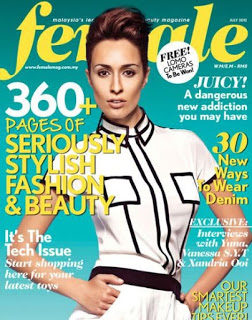
Using what you have gained from understanding and applying the Bernbach’s principles in advertising, and the knowledge gained in understanding the role and functions of an advertising art director, execute a well crafted magazine advertisement.Your client is H&M Fashion and it intends to wish its young female clients a Happy Merdeka via Female Magazine. Your job is to ensure, that the personality and style (voice and tone) of H&M’s brand and identity is retained in the creation of this ad whilst wishing female Malaysians a Happy Merdeka. Be careful not to use the usual Merdeka gimmicks. What ever you do, you must retain H&M’s young, hip, modern, fashionable, cool and exuberant disposition in your art direction when conveying the message.
Magazine: femaleSize: 210 (w) x 275 (h), Bleed: 216 (w) x 281 (h), text are: 185 (w) x 255 (h).
Marking Criteria
Communication (5%)The message needs to be creative, clear and concise. The message has to be truthful and not gimmicky. The message must be unique in order to stand out from the rest of the competitors. The message must have a sense of personality that relates to, or reflects the target audience.
Visual Impact (5%)
Visual impact here refers to the overall effect of the layout and or the artwork (visual or copy) in the layout. The visual/copy must integrate well with the message for there to be impact. The visual/copy must enhance the message to create a smile in the mind. The visual/copy must relate or connect with the reader and should illicit an emotional reaction. The visual/copy must be memorable. The visual/copy must have a sense of personality that relates to, or reflects the target audience.
Art Direction (5%)
Art direction here refers to the visual and copy “style” for the overall design. The crafting of the visual and copy must reflect good composition, appropriate choice of typeface & visual, hierarchy in communication, appropriate choice of colour and a synergy of style between visual and copy. Good art direction (visual & copy style) will reflect strong proficiency in the use of relevant software to realize the style sought after. Good art direction (layout, visual & copy style) must consist of the detailing that is involved in the creation of the advertisement.
Process (5%)
There must be exploration in the form of sketches, mind maps, thoughts and epiphanies. The journey from start to finish must be methodically documented and dated. oral or written Feedback must be documented. The written reflections must be clear, concise, revealing and insightful.
Learning goal:
1. The student will understand the role of the advertising art director and apply that understanding.Learning Outcome:
1)Writing & presenting Competencies – Demonstrate knowledge and understanding of design principles, technical processes, tools and software.2)Critical Thinking Competencies – Use critical thinking to explore, analyze and test a diversity of conceptual ideas.
3)Creating & Documenting Competencies - Plan and execute unique creative works.
4)Appraising & Valuing Competencies – Constructively assess work by yourself and others.
Deadline:
Week 10Research
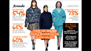
Secondary:I looked at some of the details on the H&M fashion magazine's readers here. What I found was that:
- 54% have platinum and gold cardholders
- 65% are between 20-39 years old
- 60% are professionals, managers or top executives
- 73% have a university degree
I then researched Female magazine in order to get an idea of their style and their target audience.
With that, I created a mind-map to draw together what I learnt about Female magazine and it's readers.

Ideas & Strategies:
As mentioned before, I'm still partially inclined to using a single solitary model in a freedom-like pose or stance, despite its boringness.

Here are some test shots that I did the week before with a friend.
I think I really need to look outside the box of using such a cliched depiction of freedom.
Feedback:
Mr. Vinod:
I just viewed you week 7 progression for your project 2. There seems to be more depth in this week's research. There was also indication of analysis by way of the mind-map. This was needed in the second week so that you could have used the week that passed to concentrate solely on strategy and ideation. I see you have finally looked into the readership and documented your findings, good. Again it would have been better if you could have done this in the second week because it would have informed you in your mind-mapping and development of the strategy and ideas.
There are two major tasks that lie ahead, the function of this ad is to 1) showcase your ability to develop a strategy and an Ad message for H&M that creatively wishes a Happy Merdeka to Female Magazine readers, and 2) to showcase your understanding of the role of an Art Director in the visualisation and crafting of the well designed ad., and your ability to create a visual that enhances the Ad message (headline).
Your deadline for Project 2 as stated, is next week Wednesday. But seeing that you are behind on all fronts (Strategy, Headline, Visual & Ad Design), I am extending your deadline from Wednesday to Friday (midnight) for next week.
In your shoot, choose your model and the background scene carefully. It will make or break your Ad.
Reflection:
Experience
I think that advertising art direction is a more challenging project as we need to consider few aspects to convey the message clearly to the client's target audience via a magazine, while at the same time, maintaining the fashion identity of our client.
Observation
I seriously need to improve on my photography skills. Photographs play an important role in an advertisement, as it is necessary in communicating a message to the client. Failing to produce one of quality would be a waste of an advert.
Findings
At the same time, i would prefer not to create an advertisement just by placing a good looking model posing in front of the camera wearing H&M clothes, like how the usual H&M advertisement looks like. Although it is obviously much easier and time-saving but its extremely lazy intellectually.


No comments:
Post a Comment